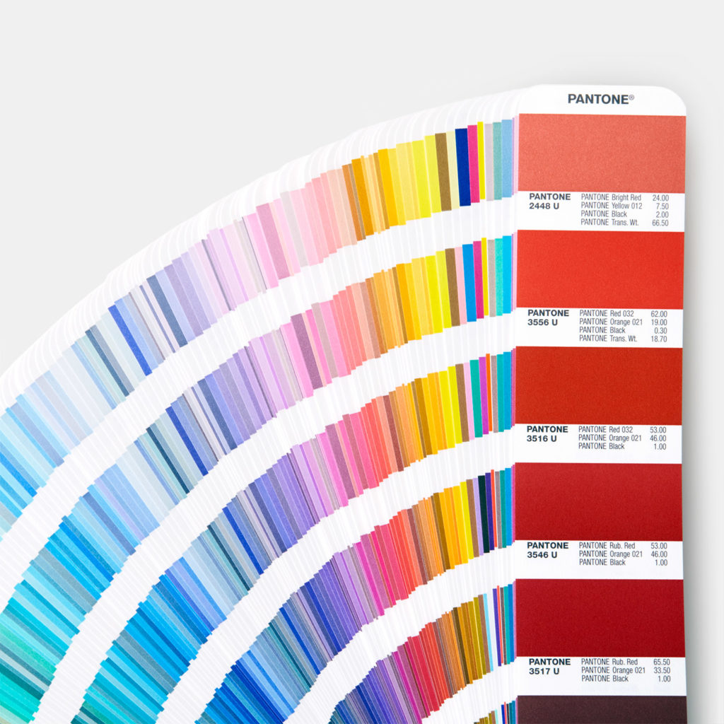
The Pantone Color System Explained

Interior design can be overwhelming for a homeowner – there are so many colors, styles, textures, patterns – where do you begin. An excellent starting point is the Pantone color system.
Today, many people are familiar with the fact that a new Pantone color of the year is chosen to spotlight each year. What they do not know is that Pantone has helped standardize the manufacturing industry through its Pantone matching system (PMS). Different manufacturers working on the same project can maintain consistent colors throughout their designs.
The widely produced Pantone Solid Colors palette has over 1100 unique colors used primarily in graphics, print, and publishing.
Unlike the CMYK colors which are made up of only four elements (black, cyan, magenta, and yellow), the PMS system consists of a wider range of colors, maximizing color consistency and reducing the degree of variation found in the CMYK system.
The Pantone color system, or Pantone Color Matching System, is the most widely used standardized color system today. There are actually two separate systems for Pantone colors – one for print and packaging, and the other for fashion and product design. The last one is the one we will focus on today.
Pantone Color System for Fashion and Product Design
The PMS color chart is used by artists, manufacturers, designers, printers, and clients for accurate color identification, design specification, and quality control.
PMS charts list thousands of colors, with the various palettes used for specific industries. For example, interior designers often turn to the textile palette to match rugs, pillows, and fabrics.
PANTONEVIEW home + interiors 2020 is the new guide that interior designers can use to examine the new color and design trends for 2020. The new guide demonstrates exciting attributes such as:
- How muted and vibrant tones can co-exist in the same room
- How to tweak traditional style with futuristic touches for an unusual and original approach
- Highlights 2,310 colors for home furnishings, interiors, paints, and more
One of the best features of the Pantone color system is when they select the Pantone color of the year, showcasing multiple color combinations that feature the chosen color. Through their standardized color matching system that uses numbers for precise identification, you can match your paint to your décor, window treatments, and furnishings with ease.
HK Interiors can help you incorporate the vibrant world of Pantone color into your home or office design here in South Florida. For more information about our services, contact us at 954-401-8542 today.
